Opening a new reading log is a special moment: there are no saved books yet, but the screen can still tell a person what to do next. Design that first view alongside the populated list, search results, and loading states. An “empty” screen is meaningful only when the app knows why it has no items to display.
This is a fictional reading-log design exercise. Its screen messages are proposed copy, and the checks below are for a future implementation. They are not observations from a running app.
Five conditions that can look empty
| Condition | What the screen says | Next action |
|---|---|---|
| First visit | No books recorded yet | Record a first book |
| Loading | Loading saved books | Wait |
| Books present | Show saved books | Open or add a book |
| Search has zero matches | No book matches this query | Clear the query |
| Request needs another attempt | The list has not completed loading | Try again |
A first visit and a zero-match search should not share the same instruction. In the first case, “Record your first book” is useful. In the second, clearing the query can reveal books already saved. Likewise, do not conclude there are no books while the request is still in progress. Choose each message only after the app has identified the corresponding state.
Make the first action visible and specific
For the first visit, a compact screen could say, “No books recorded yet. Add your first book to start your log,” followed by a button labeled “Record a book.” Keep the button near the message and use the same action wording on the destination form. A decorative illustration may help set the tone, but it should not replace the explanation or action.
Use a native HTML button for an action and give it a name that describes what will happen. MDN's button reference explains how button content supplies an accessible name, while its accessibility guidance covers icon-only controls. Test the actual label in the interface instead of assuming the visual design communicates it.
Describe the state rules to the AI assistant
Create a reading-log list screen for five states: first visit with no saved books, loading, books present, search with zero matches, and a request that needs another attempt. Give each state a one-sentence explanation and a relevant next action. Use a native HTML button for actions and descriptive visible labels. Do not display the first-visit message until a completed request confirms the list is empty. Provide sample data or controls to demonstrate each state.
Ask for example data that makes the state easy to inspect. A first-visit example has a completed empty list and no active query. A search example has at least one saved book but a query that matches none. A loading example has a request in progress. These inputs make it possible to compare the intended state with the rendered screen.
Walk through the transitions
Begin with the first-visit screen, add one practice book, and return to the list. Confirm that the book appears and the introductory message is gone. Enter a query that matches nothing, then clear it and confirm the book returns. If the app offers retry after a request interruption, use it and observe whether the message changes to the actual result. Check keyboard focus and button names during the same walkthrough.
Keep screenshots of the proposed design separate from evidence of the running app. A mockup shows intent; reproduced states show what the implementation does. The diagram below maps the five conditions to their next actions so that a single blank-list placeholder cannot silently cover them all.
Read the Korean edition of this article.
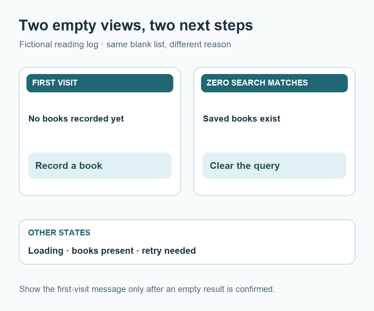
Diagram: two reading-log empty views show a distinct message and next action; loading, saved books, and retry remain separate states.

댓글